I got rather distracted by my seasonality realisation in the last post! I started off wanting to reflect about the experience of exhibiting and attending the WCPF and rather meandered off in a different direction... I'll try again!
To start with here's the best video of the whole lot: the children having a go!
Part of what I love about WCPF is the opportunity to have a go and the ethos that printmaking is for everyone. London schools are invited to experiment and a whole wall was dedicated to the children's prints. I always make a point of showing my children other children's work. I want them to realise that their images are valid and important.
My next favourite pictures are of course me with my work with red dots next to it - hurrah!


There was such a wealth of work on display that I'm still not sure I actually saw all of it. I've made a mental note to ensure that I visit alone on either the Thursday or Friday next year when I know it will be much quieter so I can try to fully appreciate it.
One print I must highlight is the one we bought. This was not my choice, but my husbands (it's his 40th year and he's great so I treated him!), he studied architecture so something about the style of this drawing appealed to him. We don't follow a religion so I'm rather ignoring the references to the story of Noah and the arc but I like all the animals and I think it's an image that I will find something new in every time I look at it. It reminds me a of Chris Orr image of a cross section of a ship.

had I any money left over my first choice of a purchase would have been a Norman Ackroyd print. I've yet to see one I don't like. The contrasts of the deep blacks against the lights, the subjects, the drama. I love them! My second choice would have been a print by Rachel Gracey. She's an artist who I discovered at last year's fair when I attended a talk she gave. I'm fascinated by her prints which are bright and full of colour but often have a lot of white space too. There's very little detail and yet you can see the image.
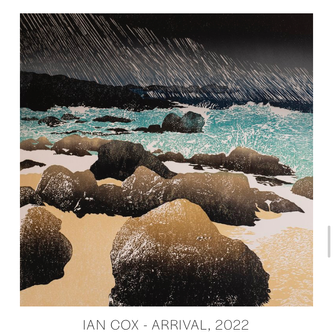
Here's a selection of what I enjoyed looking at:


Some of these I have chosen simply because they made me smile - the dinosaurs, flying lemon juicer and the champagne light switch. Some for the incredible skill demonstrated - the bear is a multi-layered screen print on wood.
John Peddar and April Wilson are artists who I admire, John for starting the 1/many initiative and the stories behind his work. I met April at the Southbank Printmakers mini print show last year. Her skill at marbling the paper and then linocutting the incredibly intricate koi is amazing.
Looking at the selection there's a definite theme of colour and subject. I'm interested that I haven't selected any figurative or urban/architectural work. I think this reflects my interests - in general I'd much rather be in the countryside or at the coast than in a city (although I don't want to be remote in my daily life - I like being only an hour from London, but 5 minutes from a big forest!). I assume I also gravitate towards landscapes because as a maker of landscapes I want to see how other people depict them.
I particularly like the prints which seem to manage some form of texture, no mean feat in a print. This is something I would like to experiment with, I'm hoping that polymer lithography might allow for some interesting textural marks as well as caustic soda lino etching... lots to think about!